
Friday, July 29, 2011
Thursday, December 9, 2010


Wednesday, November 3, 2010


Sunday, October 31, 2010
Restaurant Design In Progress...
This is a conceptual perspective for my restaurant design. I learned SketchUp this summer, and utilized that with hand-rendering as well as some photoshopping for a completely different look that I'm used to doing. It felt so good to break away from the 3dsMax photo-realistic perspectives...this technique just feels to me to have more soul and life. It's a rough process perspective- but it's the feeling of the restaurant that I wanted to convey. The final project will be posted mid-December!


Monday, September 6, 2010
Sunday, August 22, 2010


Tuesday, August 17, 2010


Monday, August 16, 2010
Best of Ringling 2010!!
The annual Best of Ringling Show in April this year was so amazing, especially since each major received their very own gallery space with all the new buildings on campus. It seems like the Best Of show is becoming bigger every year since I've been at Ringling which is really great. For the Interior Design Department this year we had a special guest judge to select projects for the show. The judge was Sascha Wagner!...noted designer and Ringling graduate from Huntsman Architectural Group in California.
Of the projects that I submitted for consideration to be displayed in the Best Of show, four of my pieces were selected by him :). Two of those four projects won prizes: "Best Use of Materials & Finishes" (1st image) selected by Sascha Wagner, and the "President's Award" (video) selected by Ringling's President Dr. Thompson. I am beyond grateful for the recognition and to have been placed alongside all the other amazing projects at the show. I'm looking forward to next year's Best Of show, which will also be my last at Ringling.
Corporate Office Design:

Residential Design:

Light Fixture Design:
 Retail Store Design & Animation:
Sunday, August 15, 2010


Tuesday, April 20, 2010
Light Fixture Design - Lighting - 3rd Year
Looking back, it feels like this project happened within the time span of a week. Interesting process to say the least...most of the ideas came through sporadic bursts of inspiration. The design was for the Robert Bruce Thompson Annual Student Light Fixture Competition. It was a refreshing challenge compared to designing an interior, because an interior of a building has so many layers of information that your eye has to sift through, whereas a light fixture is a single object, and any imperfections are staring you in the face.
The greatest challenge for me was finding inspiration for a design that was extremely simple yet timeless and elegant. I wanted to steer clear of any "decoration" or unnecessary frills for the light fixture. Added on to that, to abide by the competition rules, it had to be an exterior porch light fixture and had to take into consideration light pollution and efficient use of energy. I also learned how to wire a light fixture and all the components that it needs to operate through the technical drawings, which was actually enjoyable considering I only had a vague idea that I was doing it correctly, haha.
The inspiration came from a chair I found online, European designer Dima Loginoff's "Dounyasha" chair...unbelievably gorgeous. That led to me making a model of the light out of wire and paper, to get a better idea of how it would look from various angles. I'm satisfied with the final outcome of the four boards, but the 3d modeling of the fixture could be tremendously improved. It'll add some variety to my portfolio. The winners of the competition will be announced mid-May...so we'll see!


Thursday, March 18, 2010


Tuesday, December 29, 2009
NOLA "Green" Materials - Construction of Materials & Finishes - 3rd Year
From all our knowledge attained in our Construction of Materials & Finishes class, our final project was to put together a compilation of interior finishes and materials for a space. The space that I was assigned was a coffee shop in New Orleans, Louisiana. Of prime importance was that all our selections be as "green" or sustainable as possible. The recycled glass materials were the less difficult ones to find, with the upholstery and drapery fabrics requiring a lot more research.
I absolutely love love how my boards came out, they're probably my favorite I've designed thus far. I like how they turned out to be a more abstract interpretation of the project's concept. What I learned from this project: If I'm not feeling motivated to work on a project, which was very much the case, start off by designing the boards and layout. I learned very early on that by the end of a project you're just so burned out with no creativity left to put together decent boards, so that's what I make myself start off with.
CONCEPT:
The concept for my coffee shop is the New Orleans Mississippi Cityscape. New Orleans is one of over a hundred cities that straddle the Mississippi River, the second largest river in the United States. To New Orleans, the waters of the Mississippi have historic significance dating back to 1763 and plenty of cultural lore connecting it to the river. The focus of the concept is on the city lights of New Orleans reflected in the Mississippi's dark waters. The elements used throughout the design are line and color and the principles represented are repetition and contrast.


SUMMARY:
1. Flooring: 100% Recycled glass and marble tile.
2. Wall Panel: 100% Recycled glass and resin accent wall panel.
3. Wall Paint: Zero VOC and low odor-emitting paint.
4. Pillow Upholstery: 100% Recycled polyester.
5. Ottoman Upholstery: 100% Recycled polyester.
6. Ceiling System: 30% Post-consumer recycled content.
7. Sofa Upholstery: 100% Recycled polyester.
8. Drapery Fabric: 100% Recycled polyester.
9. Countertop: 100% Recycled glass with colored cement.
Tuesday, December 22, 2009
"Liefde" Retail Design WEBSITE & VIDEO
One thing that's always been stuck in my mind with our first introduction to the Interior Design department at Ringling were the interior animation projects they showed us to get us all excited about what laid ahead. In Interior Design there is SO much that we learn that does not even show visually in our projects. It's all knowledge about accessibility issues and guidelines, building codes, sustainability features and LEED points, and tons of technical data about material durability testing and fire ratings.
With this animation project however, the focus was solely on the visual design and the WOW factor. From the start I decided that I had to make this my pride and joy. I wanted to anything and everything to make this project beyond what I had imagined for it. I really am very happy with it. I think the song is what drove me to love the whole process of this project as much as I did. I enjoyed the level of commitment it required, I couldn't keep my mind away from it and dreaded leaving the labs for sleep.
It's projects like this that just further refine our skills for super-efficient time management and abilities to improvise and make something work when you encounter unexpected difficulties, because you really have to learn to be innovative so you can move on to the next thing and not lose any time. The visual quality is much better than shown here on youtube and the colors look very washed out compared to the original, but here it is!
CLICK BELOW:
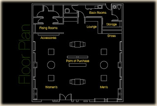
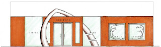
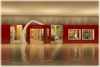
"Liefde" Retail Store Design - Digital Design Studio - 3rd Year
My design philosophy for this retail store is to design a space where the customer can feel upon entering the store the feeling of embarking on a visual journey. While walking through the store, the colors throughout will transform from a yellowish-green to a rusty-orange and finally to a deep red, symbolizing the transformation of the leaves.
Opacity, light, and color being emphasized is inspired by the visual of looking up into trees and seeing the leaves illuminated from the light shining through and around their colorful silhouettes.
Concept Collage:

Floor Plan with designated spaces & Perspective drawing of the facade:

AutoCAD drafted elevations of the facade & Interior elevations:


Hand rendered color options for the facade:


Examples of how certain elements throughout the store were inspired:
Progress screenshots while building in 3ds Max:


Computer renderings of the facade:


Computer rendered birds-eye view showing color-changing floor inlays of leaves:


Accessories Display/ Lounge/ Shoe Display/ Fitting Rooms:


Subscribe to:
Posts (Atom)